2024 marked 10 years of Briar Rose Design so I decided it was time to update our logo to better reflect the business. I worked with the super talented Eilidh Rhead to create a brand new logo that is simple and elegant. I first came across Eilidh’s work when I got engaged as she designed the logo for Katie Lees who created my beautiful engagement ring (check out Katie’s gorgeous jewelry on her website).
When I first started selling flowers, plants and terrariums at Glasgow markets in 2014, I never imagined how far this journey would take me. Ten years later, the business has blossomed into something beautiful and quite different to how it began.
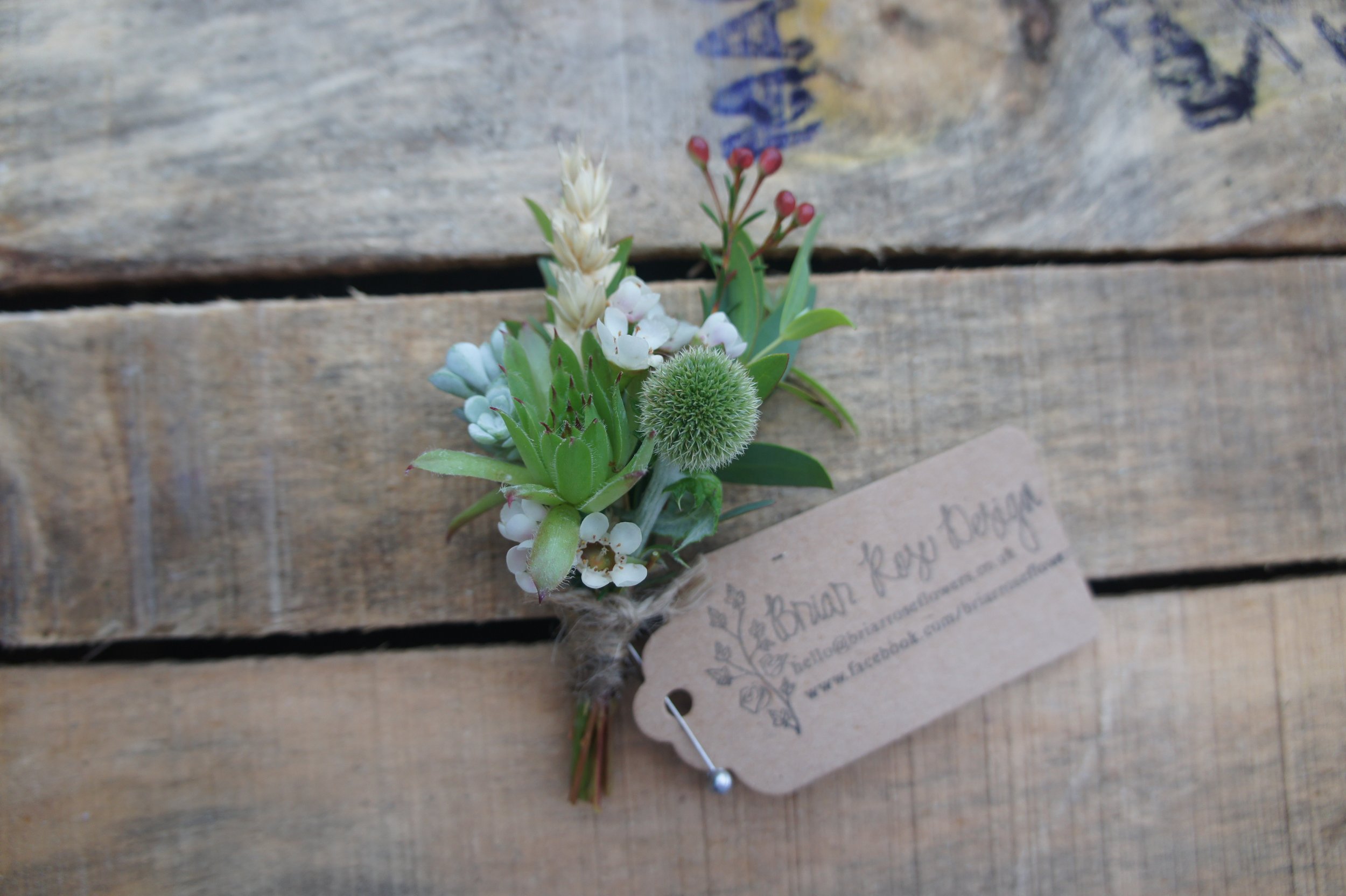
The decision to redesign the logo wasn't taken lightly. The original branding was based on a rubber stamp I had made at short notice to quickly and easily create tags on paper for market stall products. This was digitised and served as our online logo too, which worked well in those early days, and I used on the van, on flyers, business cards and stickers. However, as the business has grown to encompass wedding services, funeral tributes, corporate installations, and workshops, I needed something that could tell the full story.
Since 2014 I’ve moved to much more sustainable practices, focusing on growing my own flowers and foliage, working with other local growers and using sustainable and environmentally friendly floristry techniques. Sustainability sits at the heart of everything I now do with the business, from growing practices to packaging.
The design process began with reflection. I spend a lot of time in the cutting garden and see first hand how the seasons transform plants and flowers from tiny seeds to magnificent blooms and I wanted a sense of growth and things flowing from one thing into another which you can see in the fluid typography Eilidh designed.
Since starting the business I’ve moved to use more and more British grown blooms and after the pandemic I studied an HNC in Horticulture at SRUC which has also influenced how I view my work – it's not just about the final arrangement, but about understanding the entire life-cycle of each stem we use and how it impacts our environment. In the finished logo all the elements are connected to show this interwoven approach.
I also thought back to other key influences in my life, one of these was my grandparents. In their house there was a poster of an Alphonse Mucha painting with a beautiful woman surrounded by flowers. I always loved this poster and my grandparents later gave it to me. They gave me a love of the garden, the outdoors and creativity and always encouraged me to go for my dreams. I wanted to include similar art nouveau, botanical themes in my logo that were reminiscent of things like the Metro signs in Paris and had flowing organic shapes but still had a “clean lines” feel.
The new logo features a drawn wild flower element that captures the natural, organic quality of our work. Eilidh developed a flowing script that mirrors the movement of stems in the wind, but is also sleek and professional.
One of the most challenging aspects was creating something versatile enough to work across all our services and with different colour palettes. The logo needed to feel appropriate whether it was appearing on a wedding proposal or a corporate pitch, on our delivery van or our social media profiles. The final design incorporates a subtle nod to both the cutting garden and the business’ market stall roots – a small botanical element growing from the text. It's my way of honouring where I started while celebrating how far the business has come.
After several rounds of refinement, we've arrived at something that feels authentically us. It's a logo that tells the story of a business that has grown from humble beginnings to become what it is today, all while staying true to our core values of sustainability and natural beauty. Like the flowers we grow, this new brand identity represents both roots and reaching – grounded in our history but always growing toward what's next. We hope you like it!


